Crafting a new brand identity that balances sophistication with an inviting, approachable spirit for one of Portland’s most beloved and unique art galleries.
Branding
Illustrator, InDesign, Figma
Solo
7 weeks (Student Project)

The Challenge
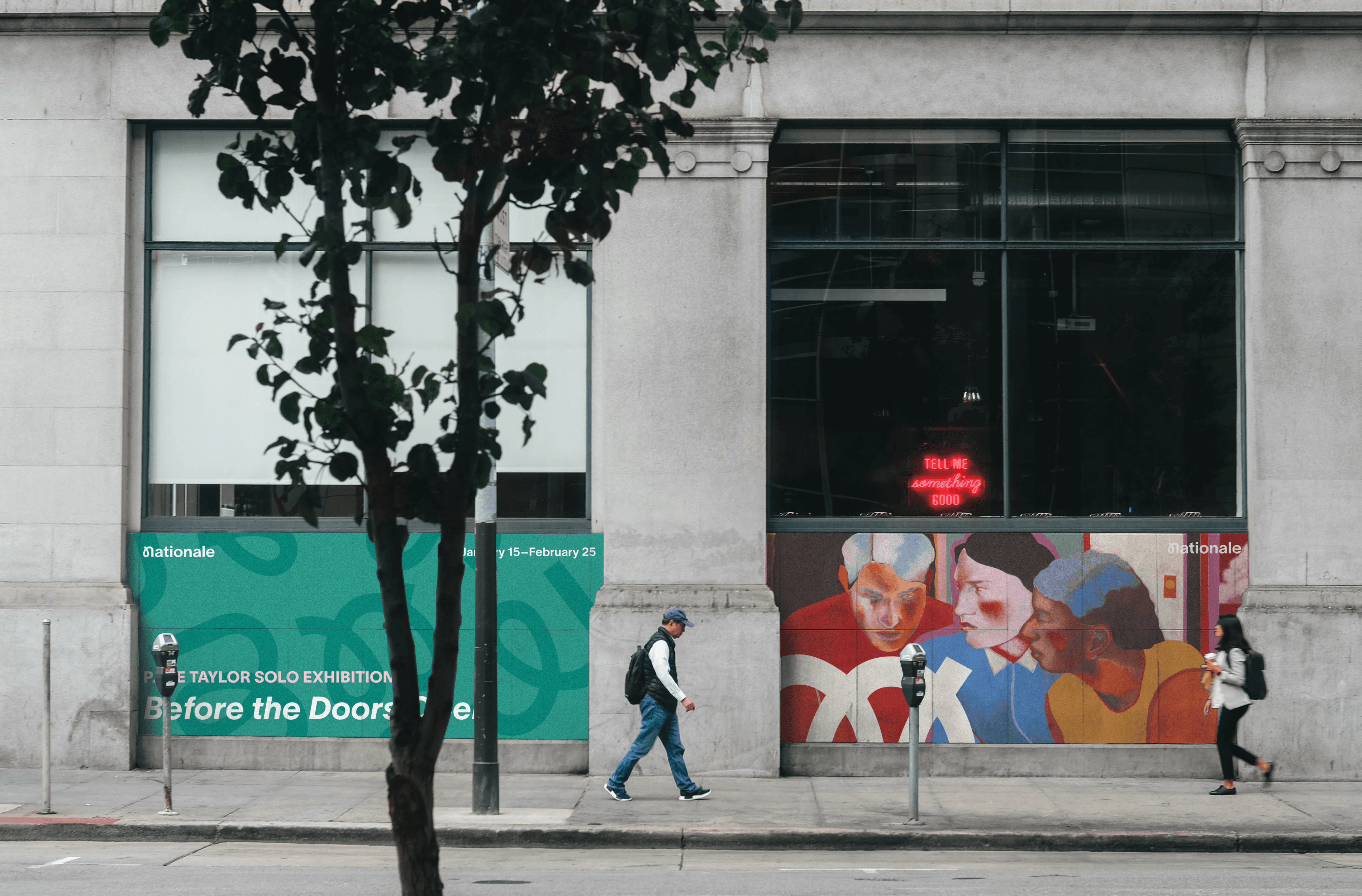
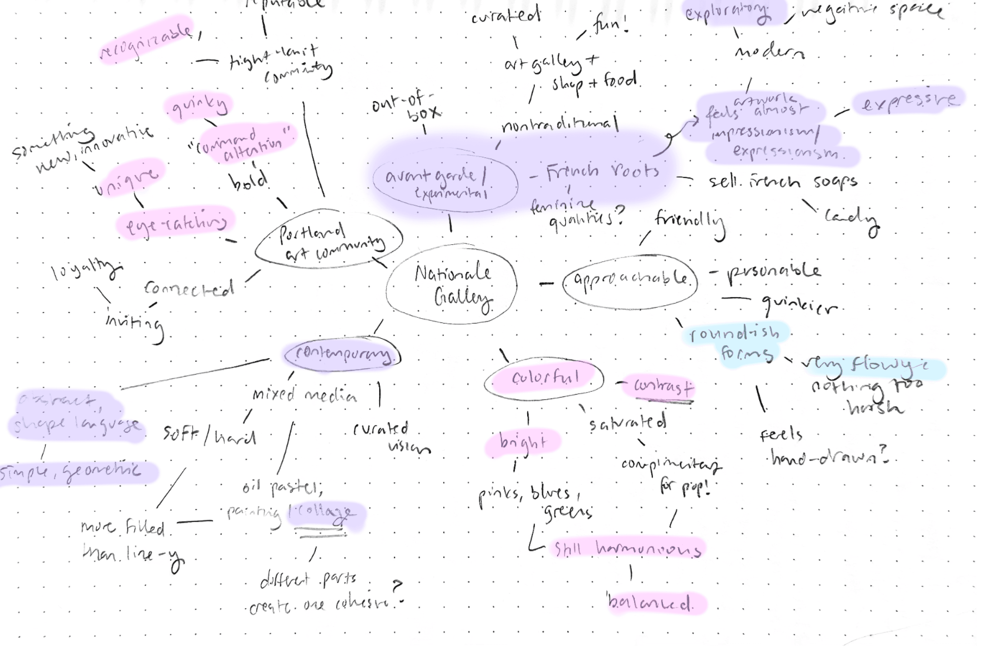
Though Nationale radiates quirkiness and warmth, its outdated branding tells a different story. Reimagining its identity was an opportunity to bring the gallery’s true personality to life and strengthen its connection with the community.
Before

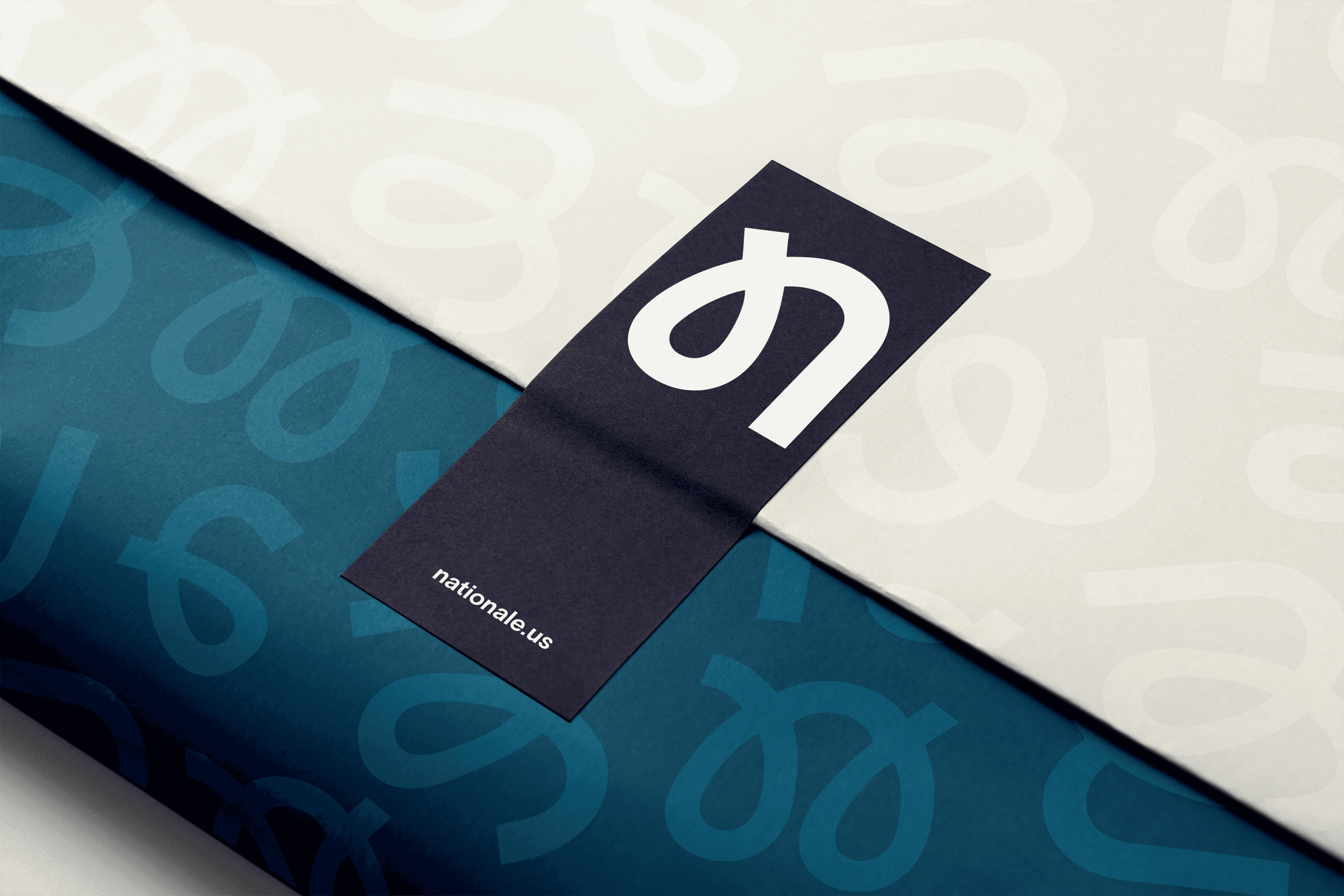
After

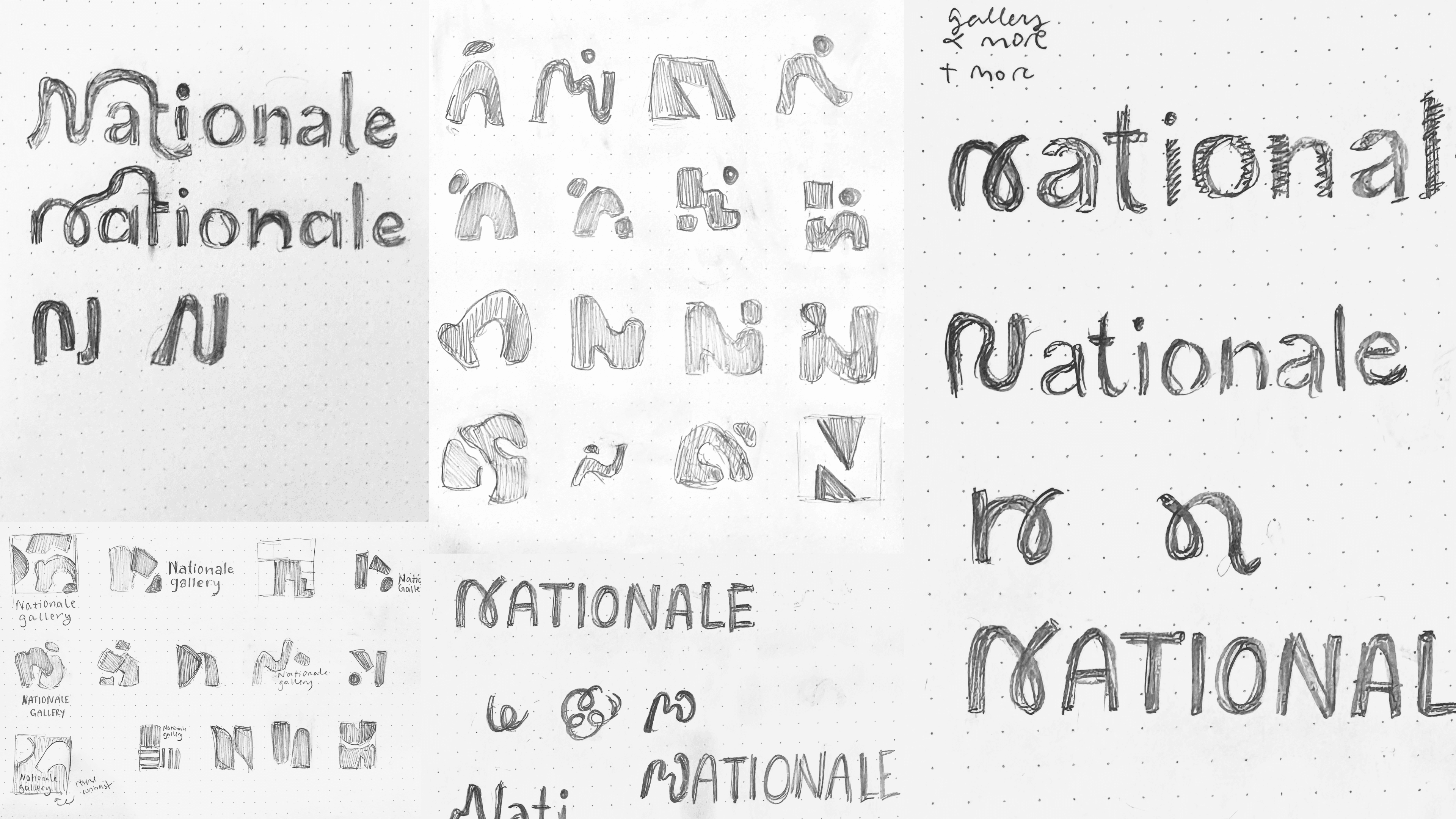
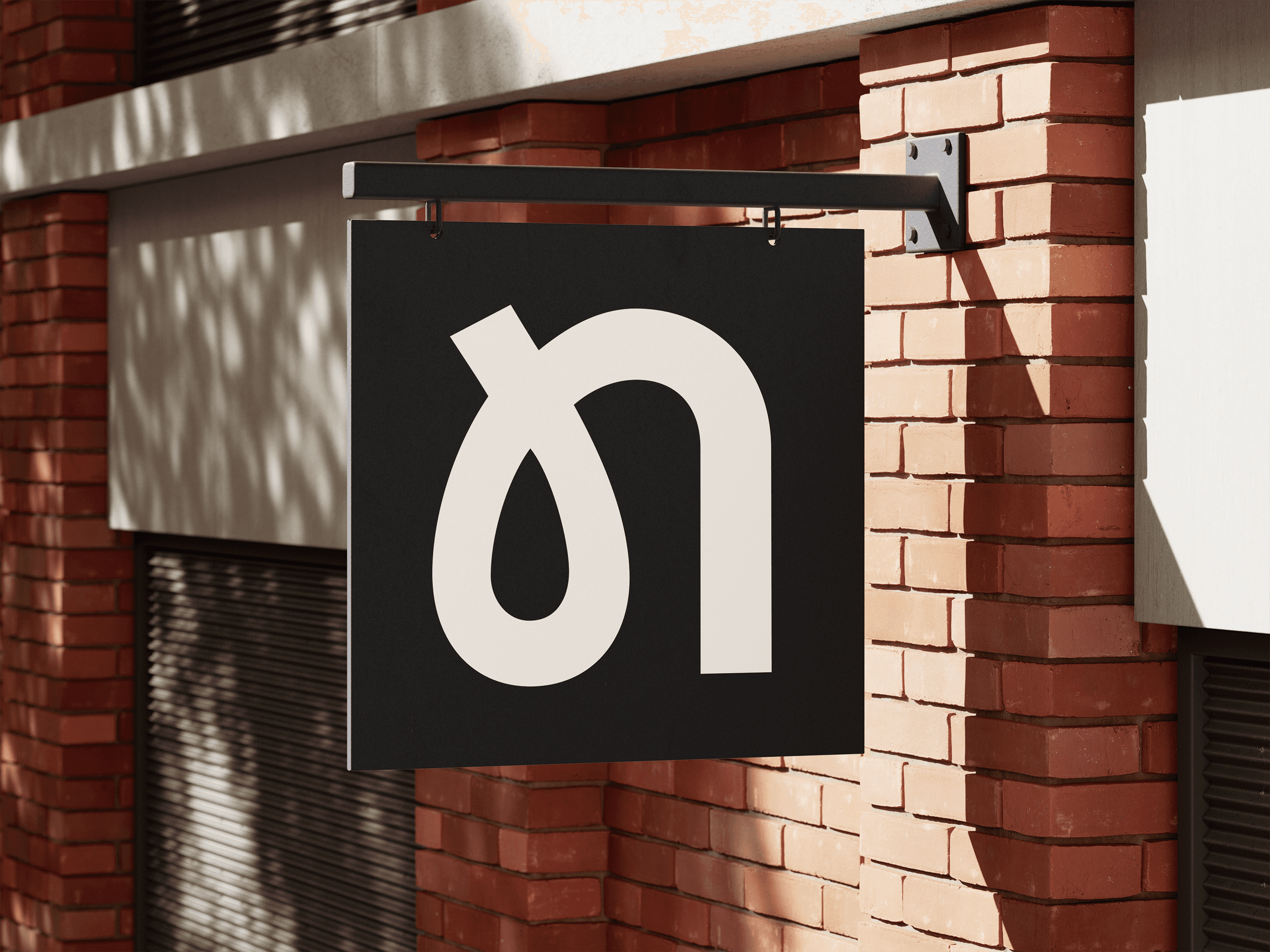
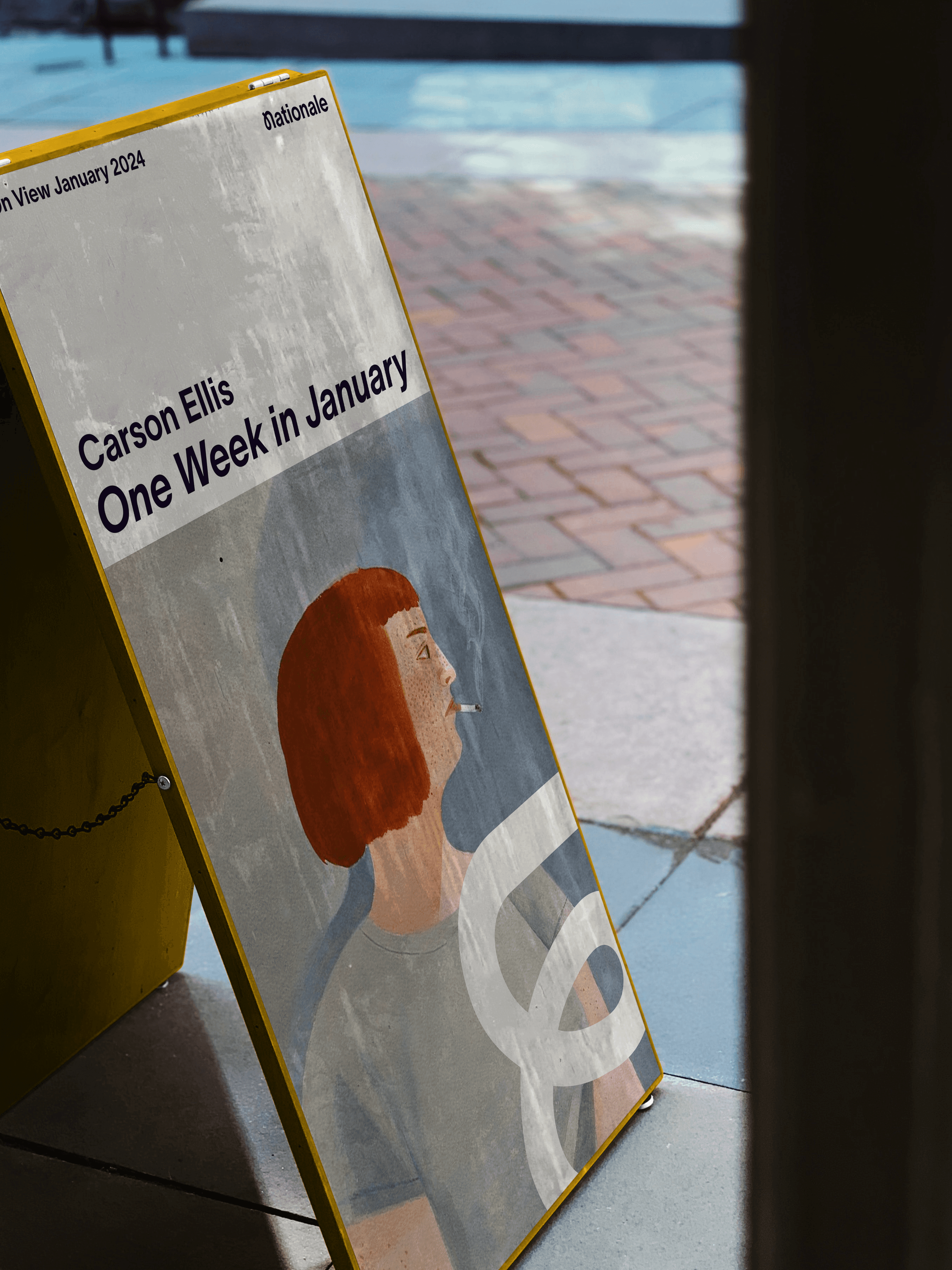
Weaving together art, artists, and community
The monogram serves as a visual metaphor for the connection between Nationale and its community. Rooted in Nationale’s values, the design balances its uniqueness with neutrality—subtle enough as to not distract from the artwork, yet distinctive and personable in its own right.
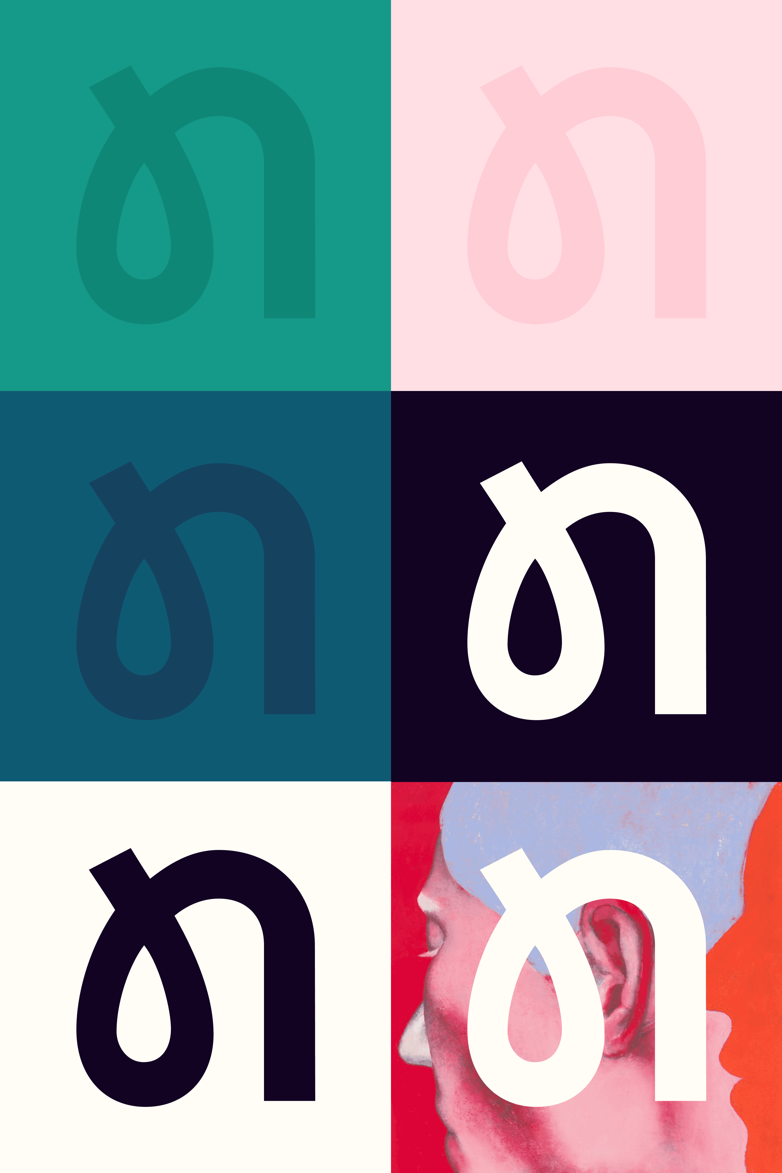
Tension between play and neutrality
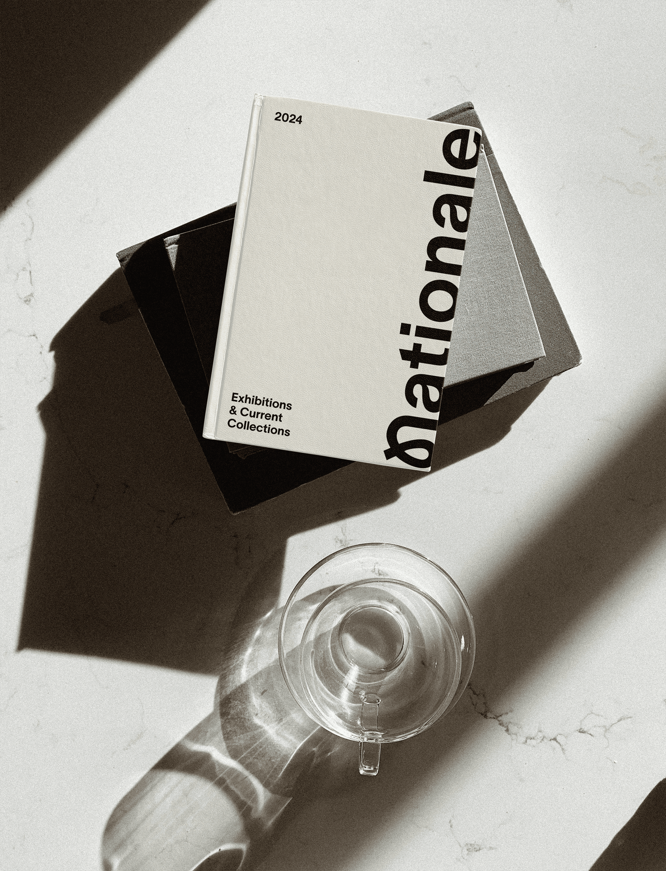
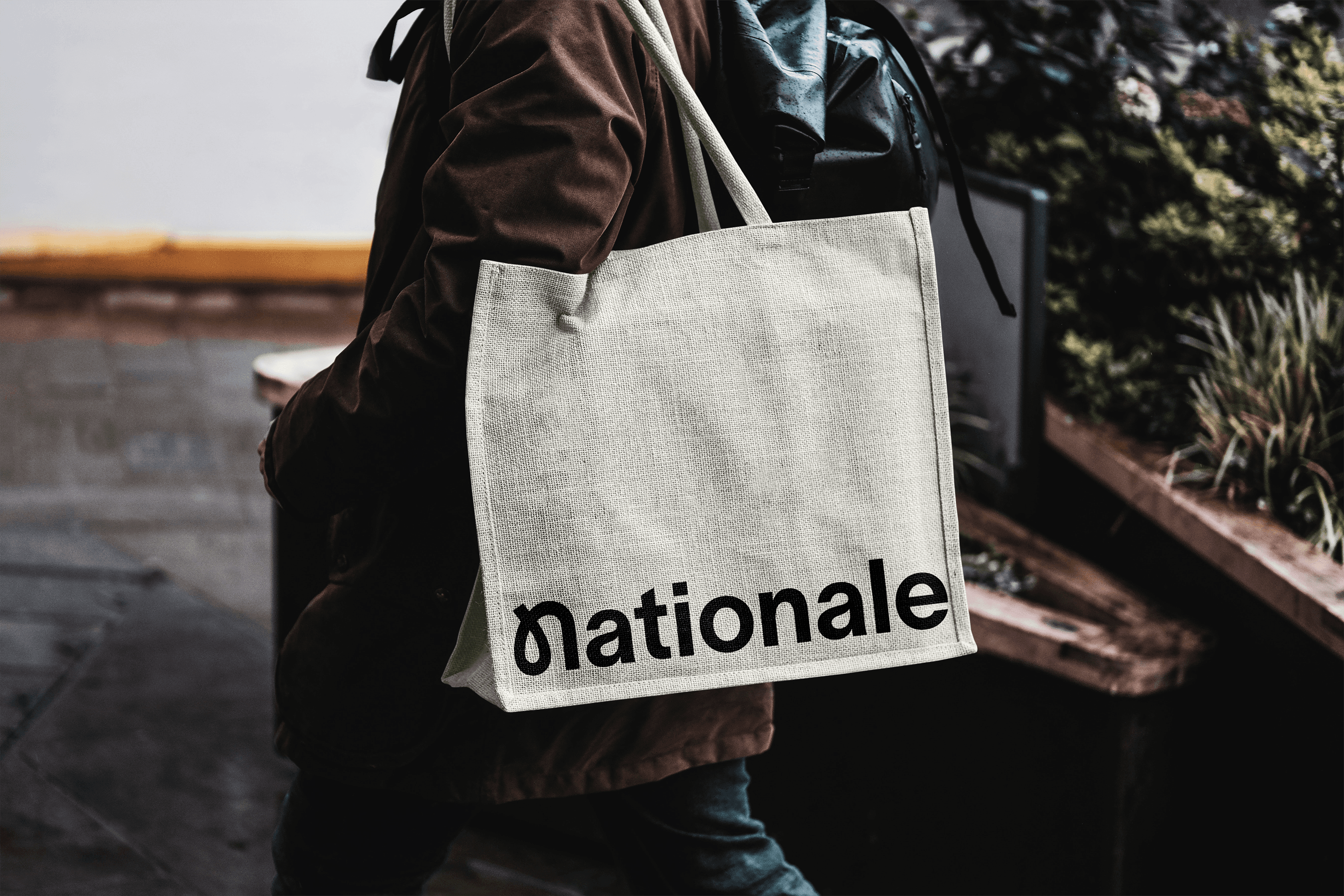
The creative direction sought to balance Nationale’s dual worlds: the neutral, refined branding often associated with galleries and the quirky playfulness. TWK Lausanne serves as the primary display and body typeface, offering a versatile neutrality that creates dynamic tension with supporting colors and graphic elements, which introduce subtle playfulness and depth.


Extending a brand system around community
Patterns and shapes extend Nationale’s identity, symbolizing community and the pathways visitors take throughout the gallery. These elements add a playful touch and capture Nationale's quirks and friendliness.